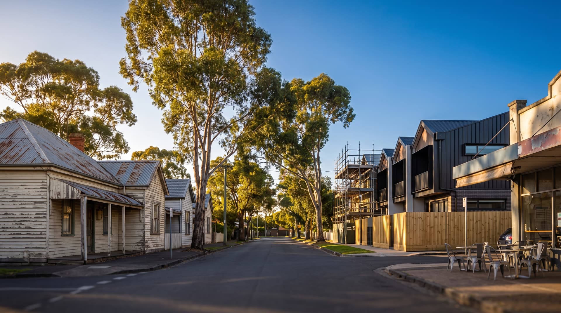
Café tables on the footpath. A microbrewery where the panel beater used to be. Builders' utes lining every second driveway. These are the signs most investors use to identify gentrifying suburbs in Australia. They are also the signs that appear after prices have already shifted.
As id.com.au's lead demographer puts it, by the time the public becomes aware of gentrification, “that horse has already bolted.” The craft beer and the soy lattes are confirmation. The real signals sit in public records that almost nobody checks.
This article works through the leading indicators first (infrastructure approvals, census income data, population pressure) and the visible street-level signals second. That order matters. If you are relying on what you can see when you drive through a suburb, you are reading a story that started years ago.
What gentrification actually is (and where it concentrates)
The term was coined in London in the 1960s to describe higher-income residents moving into lower-income urban areas, pushing up property values and displacing existing residents. Evidence of the same pattern emerged in Australia by the late 1960s and early 1970s.
In Australian capital cities, gentrification concentrates in inner and middle-ring suburbs with established public transport, schools, shopping centres, and employment access. Redfern in Sydney, Fortitude Valley in Brisbane, and St Kilda in Melbourne are textbook examples. But it is no longer confined to the inner ring. Researchers at the Australian Urban Observatory found that many of the areas most at risk are relatively recent greenfield suburbs where lower-income families once found affordable housing.
Castlemaine in Victoria illustrates how far the pattern can travel. Twenty years ago it was called “the north of north Melbourne.” Today, housing costs there have increased exponentially, pricing out many of the residents who made it a community in the first place.
How far along Australia already is
The scale of gentrification across Australian capitals is larger than most investors realise. More than a third of Sydney and Adelaide suburbs are affordable only to the wealthiest households, and a quarter of Brisbane suburbs face the same situation. Almost half of Darwin and Perth suburbs are either at risk or already well underway.
A Compare the Market analysis ranked Australian cities by gentrification signals. Sydney led with a score of 70.52, followed by Melbourne at 56.06, Canberra at 53.85, the Gold Coast at 53.21, and Perth at 47.09.
These numbers tell you where gentrification is most advanced. More useful for investors is understanding why these cities rank where they do, because the same factors that drove their scores will drive the next wave of suburbs.
Leading indicator #1: government infrastructure pipelines
Before a single café opens, council DAs and infrastructure approvals are logged in public records. The correlation between infrastructure projects and gentrification is direct. Sydney has 15 priority infrastructure projects underway, Melbourne has 12. Townsville has none, while Cairns, Darwin, and Newcastle each have one. Sydney and Melbourne sit at the top of the gentrification index. Townsville and Cairns sit at the bottom.
At the suburb level, council newsletters and DA approvals for major supermarkets or new developments are among the earliest public signals. A Woolworths or Coles approval is logged months or years before ground is broken. Boarded-up shops getting new tenants and ground-floor retail appearing in newly-built apartment developments follow the same pattern.
Where to check: Infrastructure Australia's priority project list, your local council's DA tracker, and council newsletters. These are free, public, and updated regularly. Most investors never look at them.
Leading indicator #2: ABS census income quartile shifts
This is the most analytically rigorous early signal, and it is one that very few property investors use.
The method is straightforward: track changes in household income quartile distribution over time using ABS census data. Quartile data adjusts for inflation, showing real shifts relative to the metropolitan average rather than nominal dollar increases. A suburb where the share of upper-quartile households is rising and the share of lowest-quartile households is declining is showing early-stage gentrification in the data, often before any visible change on the ground.
Rising professional occupations and degree-level qualifications in the census data are secondary confirming signals. When a suburb's workforce composition shifts toward professionals with university degrees, income growth tends to follow.
The ABS releases census data every five years, so tracking these shifts over two or three census periods (10 to 15 years) gives you a clearer trajectory than a single snapshot. The five-year lag is a limitation, but it also means genuine demographic shifts show up as sustained trends rather than noise.
Leading indicator #3: population pressure from adjacent suburbs
Gentrification does not appear randomly. It moves outward from established expensive areas as buyers are priced out and look for the next suburb over.
The Gold Coast and Brisbane recorded the highest population growth over the past decade at 22.04% and 21.96% respectively. Melbourne and Canberra also recorded strong growth at 19.53% and 19.89%. This population pressure intensifies competition for housing, and the first suburbs to feel it are inner to middle-ring areas that were initially overlooked but have become in higher demand as prices move out of reach in nearby suburbs.
The mechanism is simple. Demand rises sharply once an area starts to gentrify because it is still perceived as “relatively affordable” when you compare it against house prices in neighbouring suburbs. The affordability gradient between a suburb and its more expensive neighbour is what attracts the next wave of buyers. If you are researching high rental yield suburbs in Australia, pay attention to which ones sit adjacent to suburbs that have already moved up in price.
The visible (lagging) signals that confirm the thesis
Once you have identified a suburb through its leading indicators, the street-level signs confirm the process is underway. They do not start it.
Macro signals: Tired old warehouses or run-down shops transforming into cafés, microbreweries, or boutique retail. New hairdressers and bakeries filling formerly vacant shopfronts. Brand-new ground-floor retail appearing in newly-built apartment developments.
Micro signals: Builders' utes, cement trucks, and vans belonging to plumbers and electricians clustered in residential streets. Houses being rebuilt. New renovations visible on homes that sat untouched for years.
Streetscape changes: Café tables replacing rubbish on the footpath, new planter boxes, upgraded street lighting. More luxury cars or EVs parked at the local supermarket.
These visible signals are useful for confirming a thesis you have already built from infrastructure data, income quartiles, and population pressure. Used alone, they put you in the position id.com.au warns about: arriving after the early movement has already happened.
Timing: the early adopter window
The optimal entry point for investors is as an “early adopter”, right after the first wave of pioneers has moved in. You do not want to be the first to buy into a lower-income area. But if you are the second group through the door, there is a good chance you catch the upward movement in property values that follows.
This is where the leading indicators earn their value. Infrastructure approvals and income quartile shifts can put you into a suburb 12 to 36 months before the visible signals attract broader attention. That window is the difference between buying at the old pricing and buying at the new pricing.
The risk side: what gentrification costs
Gentrification is not a costless process. Rents increase, bills rise, and the general cost of living can soar in gentrifying areas. Service workers who provide essential city functions are priced out to outer suburbs, creating longer commutes and reducing the workforce available to local businesses.
The physical transformation can be stark. Individual knockdown-rebuilds multiply across a suburb: a house that was rented to a family gets replaced by four townhouses, each costing more to rent than the original house. Individually, that is a rational economic decision. When everyone does it, the entire area becomes unaffordable for the people who used to live there.
For investors, this context matters beyond ethics. Governments respond to displacement pressure with policy changes, zoning restrictions, and rental regulations. Understanding the social cost helps you assess political risk in the suburbs you are targeting.
Which cities to watch right now
Based on the Compare the Market and MPA analysis, the cities with the strongest current gentrification signals are:
| City | Gentrification score | Rent-to-income ratio | Priority infrastructure projects | 10-year population growth |
|---|---|---|---|---|
| Sydney | 70.52 | 58.46% | 15 | N/A |
| Melbourne | 56.06 | N/A | 12 | 19.53% |
| Canberra | 53.85 | N/A | N/A | 19.89% |
| Gold Coast | 53.21 | 56.81% | N/A | 22.04% |
| Perth | 47.09 | N/A | N/A | N/A |
The average rent-to-income ratio across Australian cities sits at 44.18%. Sydney and the Gold Coast both exceed that significantly, indicating entrenched cost pressure. Cities at the bottom of the rankings (Townsville, Cairns) have minimal infrastructure pipelines and softer population growth.
Within each city, apply the three leading indicators at the suburb level: check the infrastructure pipeline, pull the ABS income quartile data, and map the affordability gradient against neighbouring suburbs. The city-level data tells you where to look. The suburb-level analysis tells you where to act.
Putting it into practice
The sequence matters. Start with the public records (infrastructure approvals, council DAs, ABS census profiles). If the data supports a gentrification thesis, drive through the suburb and look for visible confirmation. If both layers align, you have a suburb worth serious due diligence.
Running this kind of analysis across multiple suburbs takes time, particularly the ABS data work. If you want structured support for suburb-level research, our property investment coaching walks you through the process with real data for the suburbs you are considering.
FAQ
How do you identify gentrifying suburbs in Australia before prices rise?
Track three leading indicators: government infrastructure project pipelines (check Infrastructure Australia and local council DA trackers), ABS census household income quartile shifts over two or three census periods, and population pressure from adjacent, more expensive suburbs. These signals appear in public records months or years before visible street-level changes like café openings and renovation activity.
What are the visible signs that a suburb is already gentrifying?
Warehouse and shop conversions into cafés, microbreweries, and boutique retail. Builders' utes and cement trucks in residential streets. New planter boxes, café tables on footpaths, and upgraded street lighting. More luxury and electric vehicles. These confirm gentrification is underway but typically lag the actual start of price movement.
Which Australian cities show the strongest gentrification signals?
Sydney leads with a gentrification score of 70.52, driven by 15 priority infrastructure projects and a rent-to-income ratio of 58.46%. Melbourne follows at 56.06, then Canberra (53.85) and the Gold Coast (53.21). The Gold Coast and Brisbane have also recorded the highest population growth over the past decade at 22.04% and 21.96% respectively.
Does gentrification always increase property values?
Gentrification tends to increase property values for owners, but it also raises rents, bills, and living costs for existing residents. Service workers can be displaced to outer suburbs. Governments may respond with policy changes, zoning restrictions, or rental regulations, which introduces political risk for investors in heavily gentrifying areas.